2

Friday, June 29, 2012

Hammered Silver

I love the look of hammered metal especially silver. Serving bowls, vases, candle sticks, platters I love it all. I even love hammered silver jewelry. The texture and brightness of the metal adds elegance to any room and is much brighter than plain polished pieces. Silver is a highly reflective metal anyway but when it's hammered you get a faceted surface like a diamond which reflects more light and adds even more sparkle and shine. I have a couple of small hammered pieces but am keeping my eye open for a silver bowl for my dining room buffet or living room. The other day I picked up a stunning hammered silver bowl at TJ Maxx but immediately set it down when I saw the price. Way too rich for my blood but it was beautiful. I'll keep looking for something in my price range which is as always, $0 or next to nothing. Here are a few beauties to dream about.


Monday, June 25, 2012

Don't Try this at Home

This project has been sitting in my basement for a year. It's a solid oak table that once had glass inserts with a metal grid pattern but my wonderful son dropped something on it and cracked one of the glass pieces. Oh well. I know stuff happens but I thought this would be a good opportunity to make it a little more indestructible and decided to tile it.  
To begin I added some plywood to the underside of the table so I'd have something to set the tile on. I used nails and  construction glue so it should be pretty sturdy. I couldn't find a tile thick enough to come up to the top of the table so I used some left over floor tile to make the final top high enough. It kind of works but I can see this is starting to be an epic fail because the table is getting heavy. Epic fail?!! I'm spending way too much time with my son. Since I started down this path I decided to keep with it and see if it would work. The table was in my family room which has black stained Billy bookcases from Ikea so I decided to stain it black. Painting might have been easier but I wanted to see the wood grain as you can with the bookcases. I found a water based stain called Minwax Color Express in Onyx and thought it would be easy to apply. Besides it was on sale which always gets my attention. 


I started by cleaning all the gook that my son left on the table and then gave the top a good once over with my sander. For the legs I used a sheet of sandpaper because they were  curvy and the sander wouldn't work. Next I used a slightly damp cloth to clean the dust off the tops and legs. 


After I put on the first coat of stain I wondered if I was using this product right because it just turned the wood a little brown. 


This is the table after two coats. 


I told myself don't give up, keep going and give it another coat. I finally gave it four coats of the black stain to get the right color. It's jet black but you can still see the wood grain which is exactly what I wanted. 


One tip: Prop the table up on bricks so that you can get better access to the feet. These were some leftover paver stones that I used for a mosaic project. 


I know my son is going to give this tabletop a workout so I followed with three coats of water-based sealer to give it extra protection. Here is what the table looks like now.


The next step is to tile the top. The gray 2x2 mosaic tile that you see in the picture is what I chose. It has some beautiful metallic streaks in it and I think it will be just gorgeous when I'm done but I'm keeping my fingers crossed. Stay tuned for the finished table. 


Wednesday, June 20, 2012

In love with Chandeliers

I am crazy about chandeliers and have wanted to add one to my house for the longest time. They are timeless elegant light fixtures that add tons of sparkle and shine to any room. Their styles range from traditional with lots of small delicate crystals and spiral shapes to contemporary that are more modern and geometric and tend to have fewer crystals. They come in gold, bronze, black, white, with clear, black or colored crystals and are available with and without shades. My favorite has always been chrome with clear crystals and a contemporary style is more my speed. 

Elle Decor

Sarah Richardson

Sarah Richardson

My bedroom would be the ideal place to add a chandelier but the other spot that would be perfect is by right by the front door. I have no light there so when I come in I either have to turn on a table lamp or walk fully inside and turn on a light in the kitchen. The only size that would really fit there is a mini chandelier and one that can be converted to a flushmount. 


Here are a few traditional and contemporary chandeliers that I found beautiful.


Monday, June 18, 2012

Bathroom Update Part Two

The bathroom is nearly finished. All of the hard work is done. We've installed and grouted the porcelain floor tile and the shower floor. We installed the 6" x 6" white ceramic wall tile in the shower using a running bond or brickwork pattern because I thought this might be a little more special than using the typical grid pattern. We also added a 4" band of mosaic accent tile with metallic, white marble and glass accents. This was the happy accident I mentioned previously that I am quite happy with. We are at the midway point and here are some pictures to show our progress. 


As a reminder, this is the before picture. 
Next up will be the vanity, countertop, light fixture, toilet and shower door. This bathroom sure has come a long way. Looking forward to the finish line. 

Friday, June 15, 2012

Colorful Walls

Are you a colorphobe? I am, but I really appreciate the beauty of colorful spaces. I have tried using more color in the past but eventually tired of it and ran back to neutrals where I feel more comfortable. Case in point, I painted my bedroom pink once because I thought it was feminine and romantic. I lived with it for a few years but eventually painted it a soft neutral gray-green and immediately felt more at ease. I am slowly finding my way out of my comfort zone but doubt I'll ever be completely cured.  I'm searching for ideas for my office and really want to have some fun with color. If you want to have a colorful room it's a good idea to scan the Internet or clip magazine pictures to get inspired. Here are a few rooms that caught my eye.

This is purple room is pretty but I wonder if a man would be comfortable here.
Elle Decor
The pop of ice blue works well with green. Isn't that a crazy mirror?
Elle Decor
Cozy, cheerful and elegant. The yellow chairs helps to tone done the brightness.
Traditional Home
There are several different shades of teal in this room and they all work well together.
Elle Decor
This is a bright room but may be a bit too much for me. 
Elle Decor
There's nothing to say. Intense. 
Metropolitan Home
This color floats between pink and peach. The Peach tones gives it so much warmth. 
Elle Decor
This is an icy blue room. It's beautiful but I think I would have liked more dynamic artwork. 
House Beautiful

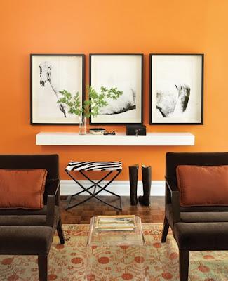
This warm color would be great for my office. I like the brown chairs and rust pillows too.
House & Home
The inlaid mirror is stunning on this teal wall. Looks more like artwork than a mirror.
House Beautiful
B.

Wednesday, June 13, 2012

Office Idea Board #1

The bathroom is nearly finished and my laundry room redo is well on it's way. The next room I want to tackle after the laundry room is my office. Right now it's painted a bright green but I've lived with it for several years and it needs freshening up. Since I've started blogging I spend a lot of time in my office so I want it to be more inviting. I want it to be a room that I enjoy working in because it's both beautiful and efficient. That's going to take a lot of thought, planning and inspiration. While scanning for ideas I spotted this beautiful office designed by Candice Olsen and featured in Elle Decor that gave me a possible direction for color choice. 

Elle Decor
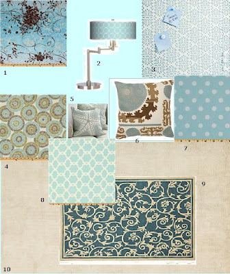
I love the pale aqua wall color, the light wood desk top, storage system and flooring. The black seating and picture frame, along with the touches of chrome really make up a lovely and serene pallet. My only concern it that it may be too serene. I'm not sure if I should be calmed or more energized in my office so I'm not sold on it yet. I'm not one to jump into a project without thinking it through first so I've decided to put together some idea boards to help me figure out how I could put this look together myself. Does this seem like a good direction to go in?

1. Fabric.com
2. Lamps Plus
3. Container Store Bulletin Board
4. Fabric.com
5. Pottery Barn
6. Pottery Barn
7. Fabric.com 
8. Fabric.com
9. Overstock.com
10. Pottery Barn

Friday, June 8, 2012

Art Quilts

A Triumph of Tulips

I am a big fan of quilts, particularly art quilts. Art quilters use contemporary quilting techniques to create quilts that are more often hung on the wall than used as a bed covering as with traditional quilts. I've met a few quilters over the years and have always admired their talent. They are true artists. There is a lot of skill involved in creating a quilt from selecting and preparing the fabric, choosing the design, laying it out, cutting and sewing or fusing the pieces together and finishing or quilting the piece. It must take patience and a lot of love for quilters to do what they do. I know because I attempted quilting in the past and failed miserably. 
Leaf-Light
I find art quilts that have a lot of bright colors are the most appealing. There is a quilt artist named Melody Johnson who creates stunning art quilts. Melody likes to dye her own fabric and uses a fusing technique to piece her art quilts together. I am not a quilter so I won't go into detail about her techniques but if you are interested in art quilting you should visit her website at Melody Johnson: Art Quilts. Here are a few more of her quilts that I thought were beautiful. 

Matchsticks

Moonstruck
Cruciform-Series Green
Under a Silken Moon

Sunflowers


Monday, June 4, 2012

A Steal for the Bathroom

For the last several months I have been debating whether or not to get a new vanity for the downstairs bathroom. I finally decided to keep the vanity but the jury was still out on whether or not to replace the countertop. 

It currently has a gray Corian top with an ivory bowl and a dingy old single handle faucet both of which have seen better days. I could replace the faucet, definitely, and replace the sink, maybe, but the countertop is in good shape and went with the overall color scheme. What I really wanted was natural stone, preferably granite but I couldn’t find what I wanted that fit within my price range which was between $0 and next to nothing. That was all resolved when over the weekend I found this beauty at Habitat Restore.


It is a six foot long white marble top with light gray veining, an ogee edge, cut outs to accommodate an  undermount sink and widespread faucet and I got for a steal at just $35. Can you believe it!!?? SCORE!!! I paid for it right then and there and called my contractor to help me pick it up. A piece like this might normally sell for about $500 so I could not walk away from such a good deal.


The existing vanity counter top is about 32" inches wide with an off center sink because there are drawers on the left side. After we cut the marble to fit the vanity there will be enough left over to use for another application. Not sure what I'll do with it but I can worry about that another day. I can't wait to see it in. 

Friday, June 1, 2012

Men in Purple

Could a man live with a purple room? The answer is yes of course, provided it's the right purple in the right room. This living room was designed by Anne Marie Midy and Jorge Almada and photographed by Simon Upton in 2011. They used a beautiful dusky shade of purple that is a perfect choice to paint a space either a man or woman could live in. I would imagine on some days this color looks more gray than purple which is why it works so well with the neutral colors it's paired with. The room is also full of large scale furniture and accessories in shades of gray and white which makes it feel more masculine but the pillows and accessories in multiple shades of purple and magenta give it a feminine touch. It's a beautiful room with lots of special touches that include:

The huge, carved, mirror over the fireplace 
The ottoman that seats 8 people or serves as a coffee table,
The gray and white checkerboard area rug,
The lighted arched bookshelves,
The floor to ceiling curtains that blend in with the wall,
The cove ceiling,
The pops of magenta throughout the room,
The extra long purple velvet sofa.

Elle Decor
I've been thinking of different colors to paint my home office. 
This shade of purple is giving me food for thought.  
What colors is your home office?
 
BLOG DESIGN © 2012 SMITTEN BLOG DESIGNS/ CONTENT © 2012 MY HOME IN THE HEIGHTS