2

Thursday, January 31, 2013

Seashell Mirror: Part 1

I really like the look of seashell mirrors. I like that no matter what, no two can ever be the same because no two seashell are the same. One day I found at the thrift store one of those old seashell wind chimes they had back in the 70's. 
I loved that it had a ton of shells and thought it would be a great start to make a seashell mirror. It was only $1.95 so I bought it. As for the mirror, I could buy a new one but since I believe in reusing what I already own I decided to use one I purchased at the thrift store several years ago for about $12. 
Before I began I painted the frame white. I didn't want the wood showing through if I missed a spot and the white paint would help disguise it. I also separated the shells in different sizes to see how much of each size I actually had to work with. I started laying out the pieces on the mirror to see what kind of pattern I wanted. I felt it should look random but needed to be organized. 
I could see I did not have enough so I bought a few more bags from the dollar store.
Before gluing any pieces down I determined how and where I wanted to hang the mirror. I won't be able to add the wall hook after I attach the shells so it's best to decide now where to attach the hooks. I want this to hang over a cabinet outside the bathroom so it would have to be horizontal. I moved the existing hooks to the short ends of the mirror and positioned them so that the hook would not show when I hung it. 

The first step was to glue the smallest shells along the inside rim with my hot glue gun. I then followed with another row of slightly larger shells. So far so good.

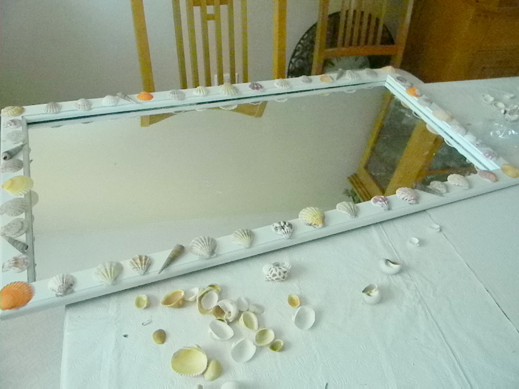
I then glued the larger shells all around the front part of the frame. Before I glued any of the shells down I laid them out to make sure I had enough and made any necessary adjustments. I'm about halfway finished and here is how it looks now. 
I had to stop here because...well...I ran out of glue sticks. Anyway, my next step is to buy more glue and fill in all the gaps with more shells. Stay tuned for part 2.

B.

Thursday, January 24, 2013

Laundry Room Curtains: Fail

This weekend I finally got around to making new curtains for my laundry room. I bought this fabric from Joann's Fabrics at least a year ago and it inspired me to paint my the walls yellow. 
Yellow is a hard color to choose because it sometimes looks too peachy, or too lemony or too tan. 
There are two different shades of yellow in the fabric which made it easier to choose the right paint color. The only problem is that I didn't buy enough. I have been trying to find it again ever since but have been unsuccessful. 

Making curtains requires a lot of hemming so since I was short on fabric I decided to make a 1/2" double fold hem on all sides. Also, instead of stitching down the folds I used fusible web which just makes it go a little faster. To hang them I  used these curtain clips I bought on clearance a couple of years ago. I've never used them but knew eventually an application would present itself. By using the clips instead of making a rod pocket I use less fabric. 
Before I started I washed and ironed the fabric. Washing takes out all the starchy stiffness from the fabric and gives it a much better hand or feel. I cut the fabric in half for each panel. Next I ironed a 1/2" double fold hem on the two long sides and then along the two short sides. 
You will have a lot of extra fabric in the corners that might overlap on the edge so it's a good idea to cut it on an angle to minimize the bulk. 

I then added the fusible web tape inside the hem, removed the protective tape and ironed it again. I always use a scrap piece of fabric to iron though when I am using fusible web in case some of the adhesive is sticking out. It's no fun cleaning glue off an iron. Next I attached the hanging clips to the curtains. Each package had seven hooks. I folded the fabric so that I would have five folds plus one clip for each end. Here are the final curtains. 
Why do I say fail? Let's see. Where do I start. First, I am no longer happy with the fabric. I don't think it's the fabric as much as it is the fabric with the yellow walls. It's too retro and the contrast bothers me. Second, there is a heating vent that I can't get around to hang the rod brackets. 
                                        
When I finally got the brackets installed, I had to hang them too low so now you can see the top of the blinds. 
Not cool. Lastly, at the end of the day I just did not have enough fabric. Since I can't get this pattern anymore I will have to try something else. I'm not giving up on this fabric. I'll find another use for it. So it's curtains for the curtains and back to the drawing board. I think I know what I want to do, but I've never tried it before and am feeling a little unsure. Nothing beats a failure but a try so I will give something new a shot. 

B.

Monday, January 21, 2013

Living Room Update 2

My glorious son started painting the living room for me. Ain't he sweet. Now, I am not a painting aficionado, I just kind of get the paint up on the wall with as few splatters as possible. The one thing I should have done, but didn't, was paint the ceiling first. I was too anxious to get the color up to see if I liked it because it takes me a long time to adjust to a new paint color. 

Walls first was probably not the best decision, but it will work out in the end. Now that it's up I am very happy with it much to my sons delight. It's a light soft gray and it's on the warm side. It instantly made the room feel open and airy which is important because my rooms are small. 


When I get around to installing the wood floor, hang new curtains and add the accessories, this room will really start to come together. Time to shop for the flooring. This may take a while because I want hardwood but I have to keep in mind the cost and durability. I've got one shot at this so it has to be right. All I know for now is that I can't wait to take up that carpet.

B.

Monday, January 14, 2013

Office Idea: Yellow

I have narrowed down the colors I am considering for my office to four: Camel, light aqua, gray-green, and gray-lavender. First up is camel. Camel is a darker less intense shade of yellow. Yellow is an energizing color but I don't want it to feel like it 7am when it's really 10pm. I think camel will give me the same energy without being too bright. 

Below is the scheme I am looking at. Very pretty and fresh.

1. Camel Paint color

No matter what color I choose I don't have funds to add all new furniture and will reuse as many pieces as possible that I already own. For the window treatments I will either install a roman blind or a simple valance instead of curtains. My desk sits right underneath a window and I have found that curtains just get in the way. I have a blue Steelcase desk chair that I got for a steal years ago. It's well made, very comfortable and I want to change the fabric and reuse it. Then again I might opt to splurge on a new chair because I am really digging this white leather chair from Overstock.com. 

Wonder what the aqua would look like. Stay tuned.

B.

Thursday, January 10, 2013

Thriftstore Finds: Door Pulls

The fastest way to update a piece of furniture or cabinets is by adding new hardware. I enjoy shopping for cabinet hardware but the cool ones don't come cheap and if I can't get a deal I don't want to buy it. For instance, my desk has seven drawers with two knobs each. If I left the holes as they are I've have to buy fourteen new knobs. If they cost a minimum $3 each, that's $42. That's more than I paid for this solid wood desk. So whenever I find a deal on hardware I take it. The trick is finding enough pieces so that you don't end up with a bunch of pieces you can't use. 

All of my pulls were $1.50 or less. The latest group I found are these. They are very heavy and solid and probably would have cost $6 to $8 a piece.

My thought was to use them on laundry room cabinets and combine them with a similar door knob. Since I could only find four I will likely use them on the drawer fronts. 

I also love these red pulls. I don't know where I will use them yet, but it will reveal it's self eventually. 
I wanted to use these silver knobs on another set of cabinets I have but I only found nine and I need ten. I may have to combine them with another pull type unless I find one more at the Habitat store. 


Also, I only  bought 1 of this gold pull because they had a ton of them and I don't know if I would use gold pulls for anything. I have to mull it through, but for $0.75 each, I may just grab a few and hold on to them. 

B.

Monday, January 7, 2013

Home Office Ideas

I spend a lot of time in my home office. I work on my blog, pay bills, surf the net, shop, watch a little TV, you name it. Right now it's just a place where I have my desk, laptop, TV and sewing table but I want it to be much more than that. It should be a place I want to be in everyday whether I am relaxing or working. 
I initially thought I wanted an office like this from Candice Olsen but now I am not sure.
Elle Decor
I also really love this yellow and white office from Sarah Richardson. Just plain lovely.
Sarah Richardson
I also love the warmth of this office by Brian Kucharski:
House and Home
How could you not be energized in this light and bright office by Kelly Deck. Check out the pop of pink. 
House and Home
On Sarah 101 it looked as though they painted their office a shade of lavender similar to the curtains in this office designed by Roger Thomas. It really caught my eye and has given me food for thought.
Elle Decor
This is a soothing shade of green chosen for an office designed by Ray Booth and John Shea.
Elle Decor
This office designed by Tommy Smythe features a warm camel wall color, crisp white trim and bold chevron curtains. 
House and Home
This office designed by Git Gustavsson has beautiful, rich, chocolate painted walls. 
House and Home
Suzanne Dimma's seafoam green painted office is just so pretty.
House and Home
My home office has been a somewhat tired shade of green for at least five years. That I haven't painted it by now has got to be some kind of record. It's time for a change.  For the life of me I cannot decide what color I want the room to be. On a dime I can switch from wanting a warm cozy office to something bright and cherry. My thought is to rearrange it to make it more usable for now. Get the plan right and the decorating will come later. So here is my initial plan:

  1. Move file cabinet downstairs
  2. Paint
  3. Paint desk (maybe)
  4. New Lighting
  5. New or revamp window covering
  6. Replace Closet door
  7. Paint sewing table
  8. Improve storage
  9. New Chair
The first order of business is to have a little purge party and get rid of what I don't need. Check out my progress in the coming weeks.

B.

Friday, January 4, 2013

Living and Dining Room: Color Scheme


I may have landed on a color scheme for my living and dining rooms. I've thought about it quite a bit and decided that I wanted to go cooler. Notice I said cooler, not totally cool. I have no intention of buying all new furniture so I will need to work with the warm tones of my existing sofa and dining room set. I also know I want to use a neutral paint because I like to change things up often. By keeping the background neutral I can change the accessories as often as I want and get a whole new look with very little cost or effort. My son will be happy to hear that. Just ask him home many times he's had to paint my living room.

The walls of my living and dining room are going to be gray. There are a thousand different shades of gray that are either cool or warm. I decided on a warm gray because I felt that the cool grays were looking too blue and that was not the direction I wanted to go. Here are the paint choices I've been looking at. 


And here is what I chose.


I think this will keep the room light and will complement my furniture well. For the floors I haven't decided yet on a dark walnut or a light wood like maple but am leaning light. I don't want my furniture and floors to blend together so I am concerned about using a mid tone wood. I also have to keep in mind that my pug sheds a lot and a dark wood would show a lot of hair but light wood might more easily show wear. All things to keep in mind when I shop. 


As for the color scheme I want to find fabrics that are cheery, bright and cool. You can probably tell from this picture what direction I am going in. 

Yep, the bubble glass bottle. I found this gem at Salvation Army thrift store a few months ago and fell in love with it. I thought about using green, coral, light blue or lavender as an accent color but this aqua blue feels most comfortable to me. So that's it. My living room will be shades of tan, white, light gray, and aqua. 

Now I am on the hunt for fabrics. 

Wednesday, January 2, 2013

Living Room Redux: The Plan

I'm determined to make my first project for 2013 redecorating my living and dining rooms. It has been all shades of earth  tones ever since I bought the house and it is need of refreshing. Here is how the living and dining rooms look today. 


So here is the plan:

New Curtains
Replace carpet with wood
Paint 
Buy two matching end tables
Find two matching lamps
Accessorize with what I have at home
Freshen up existing furniture with paint or stain
Make Roxie a new bed


Also I want to give my house a little something special and add a few architectural details such as:

Crown Molding
New taller baseboards
New Door Hardware
Replace the tile Floor
Pot Lights
Add an entry light 

As always, I like to do things on the cheap so I'll shop my thrift stores seeking out bargains. When I find a deal I'll grab it even if I am not ready to use it. Somethings I will be able to tackle myself. Other projects such as adding a new light are best left to the professionals.

I am so ready to get started. Year 2013 is going to be a banging year. Oh yes.

B.
 
BLOG DESIGN © 2012 SMITTEN BLOG DESIGNS/ CONTENT © 2012 MY HOME IN THE HEIGHTS